Custom plotting#
It can sometimes be useful to add custom annotations or plot elements to the output of corner.corner.
This tutorial shows how you can do this.
For example, let’s say that we want to overplot a few different values for comparison.
The truths interface isn’t sufficient for supporting this use case, so here’s how you can do it.
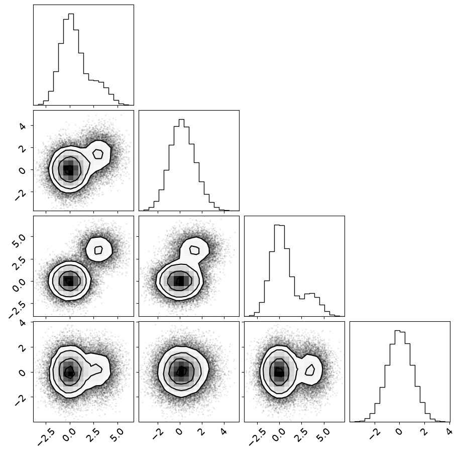
First, let’s generate some fake data with a mode at the origin and another randomly sampled mode:
import corner
import numpy as np

ndim, nsamples = 4, 50000
np.random.seed(1234)
data1 = np.random.randn(ndim * 4 * nsamples // 5).reshape(
    [4 * nsamples // 5, ndim]
)
mean = 4 * np.random.rand(ndim)
data2 = mean[None, :] + np.random.randn(ndim * nsamples // 5).reshape(
    [nsamples // 5, ndim]
)
samples = np.vstack([data1, data2])

figure = corner.corner(samples)
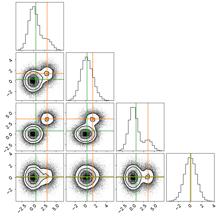
Now let’s overplot the empirical mean of the samples and the true mean of the second mode.
# This is the true mean of the second mode that we used above:
value1 = mean

# This is the empirical mean of the sample:
value2 = np.mean(samples, axis=0)

# Make the base corner plot
figure = corner.corner(samples)

# Extract the axes
axes = np.array(figure.axes).reshape((ndim, ndim))

# Loop over the diagonal
for i in range(ndim):
    ax = axes[i, i]
    ax.axvline(value1[i], color="g")
    ax.axvline(value2[i], color="r")

# Loop over the histograms
for yi in range(ndim):
    for xi in range(yi):
        ax = axes[yi, xi]
        ax.axvline(value1[xi], color="g")
        ax.axvline(value2[xi], color="r")
        ax.axhline(value1[yi], color="g")
        ax.axhline(value2[yi], color="r")
        ax.plot(value1[xi], value1[yi], "sg")
        ax.plot(value2[xi], value2[yi], "sr")
A similar procedure could be used to add anything to the axes that you can normally do with matplotlib.
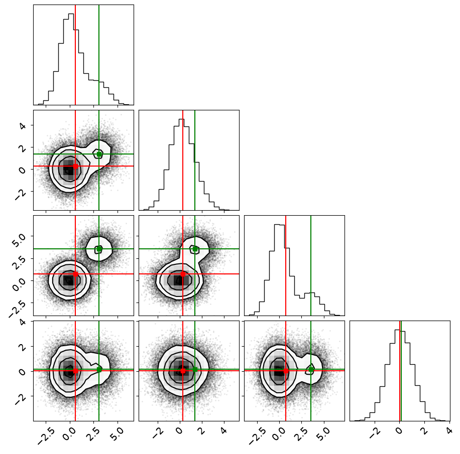
This being said, there is actually an even easier way to do this using the overplot_lines and overplot_points functions:
# This is the true mean of the second mode that we used above:
value1 = mean

# This is the empirical mean of the sample:
value2 = np.mean(samples, axis=0)

# Make the base corner plot
figure = corner.corner(samples)

corner.overplot_lines(figure, value1, color="C1")
corner.overplot_points(figure, value1[None], marker="s", color="C1")
corner.overplot_lines(figure, value2, color="C2")
corner.overplot_points(figure, value2[None], marker="s", color="C2")